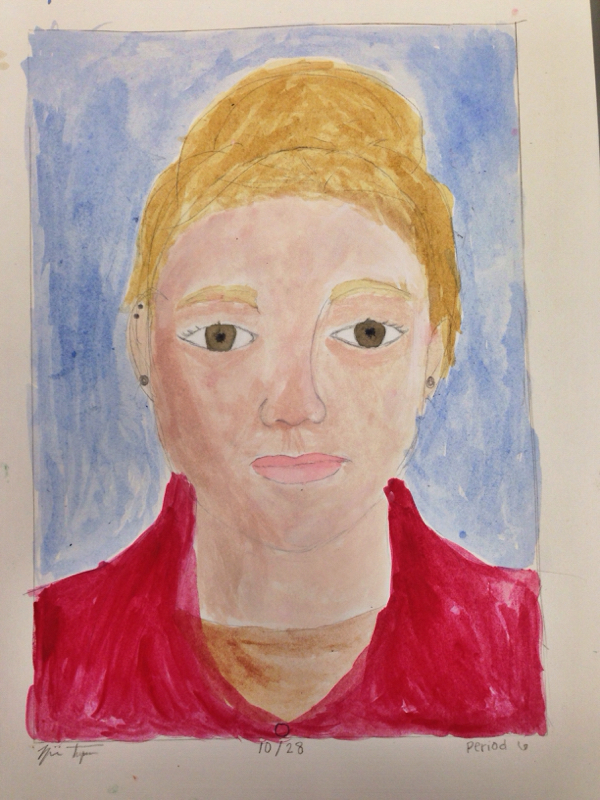
Painted a self portrait with my signature bun on the top of my head. I used complementary colors such as the blond(yellow) and the blue/purple back ground. I used shadow and highlights on my face by using different shades. Art elements I used were color, form, shape and space to create a cohesive painting that had emphasis. The mood is relaxed because that's how I look.
This is the first time I've ever attempted to draw a realistic face. I practiced multiple times in this class and once at home to get this result. I worked on shadow and focus using a pencil for value and form. My portrait shows a variety of design elements such as emphasis and proportion. I gave my self big eyes and a nose like mine. I did my best and believe it portrays a serious mood. Latley we have been working on water color leaves and complementary colors. To paint a leaf you should start with a boarder, which I did and then draw your leaves then paint on plain yellow to every leaf and add the color on top of what you want. My leaves were yellow, brown and red. Green, yellow and red was my second, and my third was orange, yellow and red. I painted a background purple complementary color for the design element of contrast I also have value and form. The mood is grace. This hall way drawing was a difficult project becuase Im still learning about perspective. I used line, value, shape and space to create a hall way. My hall way had main features such as locker, a water fountain and a door. I used strong value to show perspective and pattern. I was closer to the water fountain so it is almost larger than the door becuase of the one point perspective. All of the elements I used created disign elements like proportion. The mood of my hall way is construction because my drawing includes only straight lines and no clear emotion. |
AuthorWrite something about yourself. No need to be fancy, just an overview. Archives
January 2016
Categories |